World Cup Logo & Emblem: Design Analysis and Custom Versions
The 2026 FIFA World Cup logo and emblem is a flexible design system, not a single mark. Its core is a monochrome trophy over a stacked “26”, which acts as a blank canvas. The 16 host cities then apply their own colors and patterns to this framework, creating unique local versions while maintaining global brand identity.
The official 2026 FIFA World Cup logo and emblem features the World Cup trophy layered over a stylized, vertically stacked “26”. It was unveiled on May 17, 2023, at the Griffith Observatory in Los Angeles. This design acts as a flexible framework, allowing each of the 16 host cities across Canada, Mexico, and the USA to create their own colored and patterned versions.
Most people see the logo and stop at the trophy and the number. They miss the system. This isn’t a single static image you stick on a poster. It’s a vessel. The monochrome base is a blank canvas, and the real story is in the 16 different versions painted by the host cities. You get the core brand identity from FIFA, and then local culture does the rest.
This guide breaks down every element, from the 48 geometric units that build the “26” to the wave patterns on the Los Angeles variant. We’ll look at the mascots, the ball, the poster, and why this logo is built for the biggest World Cup ever.
Key Takeaways
- The 2026 logo is the first to depict the actual World Cup trophy alongside the host year (“26”) in the primary emblem.
- Its minimalist black, white, and gold palette is intentionally adaptive, serving as a base for 16 unique host city designs.
- The “26” symbol is constructed from 48 individual geometric units, a direct nod to the tournament’s expansion to 48 nations.
- Localized versions integrate city-specific imagery, like waves for Los Angeles and the Golden Gate Bridge for San Francisco, under the “WE ARE 26” unity campaign.
- Complementary assets like the “Trionda” match ball and a collaborative tournament poster complete a holistic branding system focused on continental unity.
What Does the 2026 World Cup Logo Mean?
Look past the trophy. The stacked “2” and “6” are built from 48 distinct shapes—squares and quarter circles. That number isn’t random. It’s the count of teams competing for the first time in 2026. The shapes themselves echo a football pitch seen from above and the curve of a ball in motion.
The official emblem for the FIFA World Cup 2026 consists of the FIFA World Cup Trophy imposed over the number 26, which is depicted in a stylized font constructed from geometric shapes. The design is registered with the Canadian Intellectual Property Office under trademark number 2258937.
The trophy’s placement is a historic first. Previous logos used abstract representations or silhouettes. Putting the real thing front and center makes a simple statement: this is the ultimate prize. The monochrome scheme of black, white, and gold isn’t just sleek. It’s functional. It provides a neutral base so the host city customizations don’t clash.
TL;DR: The logo combines the physical trophy with a geometric “26” representing the 48 teams, all set on a neutral canvas meant for local customization.
The Design System: More Than Just a Logo
FIFA didn’t just commission a logo. They built a design language. The goal was an “identifiable brand structure for years to come,” according to their announcement. This system includes a custom wordmark that integrates the “26” symbol, a supporting typeface paired with Noto Sans, and a library of graphic patterns that amplify the core icon.
This approach is a direct response to the tournament’s unprecedented scale. With 16 host cities, three nations, and 48 teams, a single rigid logo would feel alien in some locales. The system provides consistency while enabling local expression. Think of it like a national team’s kit. The badge and colors are fixed, but the manufacturer’s template adapts each cycle.
The launch event at the Griffith Observatory was symbolic. It framed the tournament as a forward-looking, almost celestial event. FIFA President Gianni Infantino called it the “biggest, best and most inclusive FIFA World Cup ever.” The design system is the visual tool meant to deliver that promise.
Common mistake: Judging the logo solely on the base black-and-white version — that’s like reviewing a canvas before the paint dries. The host city variants are the finished product.
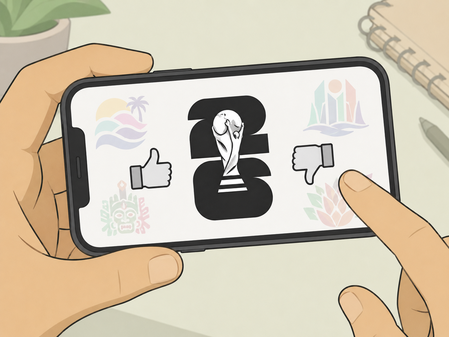
How Did Host Cities Customize the Logo?
![]()
The base logo arrived as a template. Each host city’s design team received this framework and a mandate: infuse it with your local identity. The results are the most democratic set of tournament emblems ever produced.
Los Angeles took the geometric blocks of the “26” and filled them with rolling wave patterns. You can feel the Pacific Ocean. San Francisco threaded an illustration of the Golden Gate Bridge through the number. Mexico City’s version uses a vibrant palette and patterns inspired by traditional Talavera tilework. Vancouver incorporated elements of First Nations art into the design.
This process turns a global emblem into a local point of pride. It’s a visual agreement. The city acknowledges its role in the larger “WE ARE 26” campaign, and the tournament acknowledges the city’s unique character. You can see this philosophy extend to other tournament assets, like the collaborative artwork for the opening ceremony branding.
The table below shows how three cities interpreted the same geometric framework.
| Host City | Customization Theme | Key Visual Elements |
|---|---|---|
| Los Angeles | Coastal energy & innovation | Wave patterns within the “26”, blue/teal color palette |
| Mexico City | Heritage & vibrancy | Talavera tile patterns, bright pinks and yellows |
| Vancouver | Natural landscape & Indigenous art | Organic shapes, forest green and deep blue tones |
Finding all 16 designs used to be a scavenger hunt. Now they’re integrated into each city’s host city branding and merchandise. This localization effort is a key part of the broader 2026 World Cup news cycle.
Public and Critical Reception: Love It or Hate It?
Initial reactions online were polarized. On one side, critics called it lazy, bland, or underwhelming. A popular YouTube designer critique argued an unreleased concept version was superior, stating “You don’t have to be a designer to see that the first version was better.” The plainness of the monochrome base fueled this fire.
On the other side, branding experts saw the strategic move. A simple, iconic base is more adaptable. It won’t fight with the host city layers. A complex, colorful base logo would limit customization options. The negative space in the design is a feature, not a bug.
The conversation shifted as the host city versions rolled out. Seeing the Los Angeles waves or the Mexico City colors applied transformed the perception. The logo stopped being a thing and started being a tool. This is the core argument for the system’s success. It’s designed to be built upon, not just observed.
I preferred the leaked concept at first glance. It had more motion, more football energy. But after seeing the San Francisco version with the bridge integrated so cleanly, I got it. The simple base lets the city’s story be the hero. A busy base would have buried that.
The debate mirrors discussions about modern team jersey designs. Is a clean template boring, or is it a smart platform for storytelling? For a tournament of this scale, FIFA bet on the latter.
The Supporting Cast: Mascots, Ball, and Poster
A logo doesn’t work alone. The 2026 identity is part of an ecosystem.
The 2026 Mascots: Maple, Zayu, and Clutch
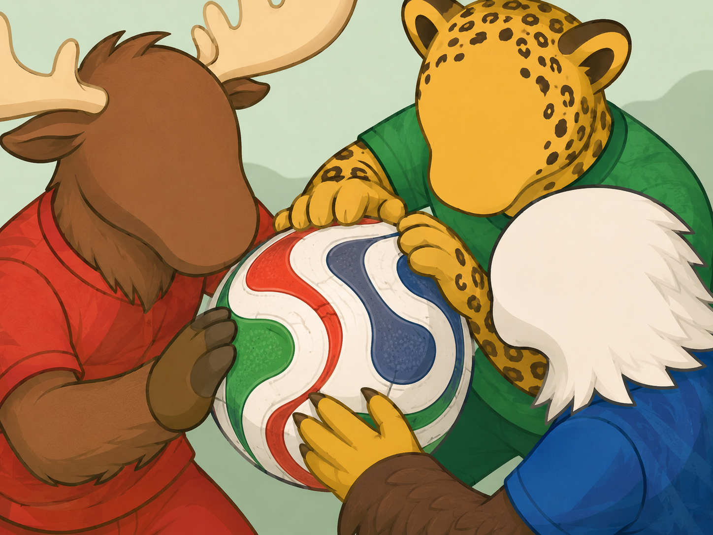
The tournament features three mascots: Maple the Moose (Canada), Zayu the Jaguar (Mexico), and Clutch the Bald Eagle (USA). They’re more than cute characters. Each represents the wildlife and spirit of their host nation, physically embodying the “WE ARE 26” unity theme. Their designs are modern and sleek, meant to appeal to a global audience while feeling locally authentic. This trio continues the long and sometimes quirky history of mascots.
The Official Match Ball: Adidas “Trionda”
Adidas named the official ball “Trionda,” meaning “three waves.” Its design features three distinct waves in red (with maple leaves for Canada), blue (with stars for the USA), and green (with an eagle for Mexico) that converge into a triangle. It’s a direct, beautiful expression of continental unity. The ball’s name and design philosophy make it a key part of the official match ball legacy.
The Tournament Poster
Released 100 days before kick-off, the official poster is a collage-style piece. It centers on a player and is the work of three artists: Carson Ting (Canada), Minerva GM (Mexico), and Hank Willis Thomas (USA). This collaborative creation method perfectly echoes the logo’s adaptive system and the tournament’s core message. It sits alongside the 16 individual host city posters, forming a complete artistic set.
TL;DR: The mascots, ball, and poster all reinforce the logo’s themes of tri-national unity and local expression, creating a cohesive brand world.
How Does It Compare to Past World Cup Logos?

Historical context is everything. Past logos often tried to capture a specific host nation’s culture in a single, locked image.
- 2010 South Africa: Used a colorful, silhuetted player reaching for a map of Africa. It’s vibrant and distinctly African.
- 2014 Brazil: Featured a trophy illustration formed by green and yellow hands in a loving embrace. It’s warm, human, and unmistakably Brazilian.
- 2022 Qatar: The “Infinite Loop” or “Desert Maroon” design was an abstract, flowing ribbon symbolizing continuity and the dunes.
The 2026 approach is a fundamental shift. It doesn’t try to be “North American.” Instead, it provides a structure for 16 different North American stories to be told. This makes direct comparison tricky. You’re comparing a finished painting (2014) to a frame and a set of paints (2026).
The evolution is clear. Logos have moved from literal representations (1998 France’s rooster) to abstract concepts (2022’s loop) to now, a customizable platform. This might be the new blueprint. Future tournaments could adopt a similar system, using a core emblem that host nations or cities then personalize. It solves the problem of representing an increasingly complex, multi-host tournament.
Trademark and Legal Protections
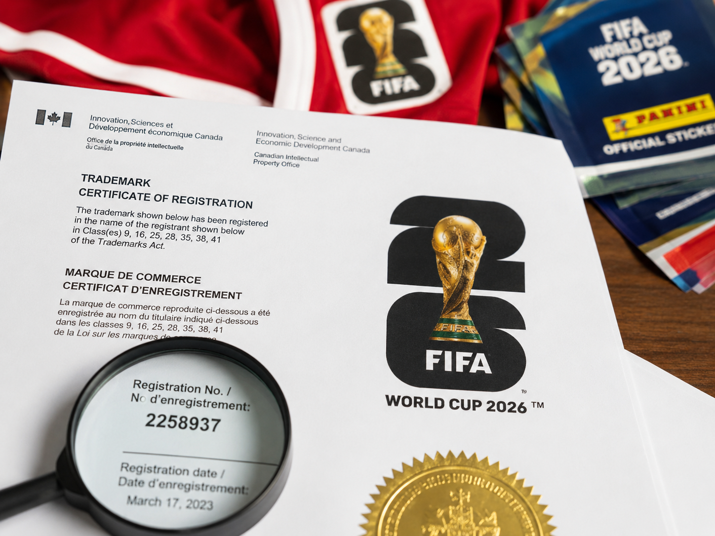
The emblem isn’t just art; it’s a commercial asset. FIFA registered the design officially. In Canada, it’s protected under trademark number 2258937 with the Canadian Intellectual Property Office. This registration covers the specific depiction of the trophy over the stylized “26.”
This legal protection is standard for major tournament IP. It prevents unauthorized commercial use on merchandise, prevents counterfeiters, and ensures FIFA controls the brand narrative. You’ll see this trademark on all official merchandise, from the Panini World Cup 2026 stickers to the fan jerseys.
The host city variants likely operate under a sub-licensing agreement. A local organizing committee can use their customized version, but the underlying emblem IP still belongs to FIFA. This balance protects the central brand while empowering local execution.
Frequently Asked Questions
When was the 2026 World Cup logo revealed?
FIFA unveiled the official brand identity for the 2026 World Cup on May 17, 2023, at an event held at the Griffith Observatory in Los Angeles.
Why does the 2026 logo look so simple?
The black, white, and gold base design is intentionally minimalist. This simplicity makes it a versatile “vessel” that can be adapted and colored differently by each of the 16 host cities without visual clutter or conflict.
What do the mascots for the 2026 World Cup represent?
The three mascots are Maple the Moose (Canada), Zayu the Jaguar (Mexico), and Clutch the Bald Eagle (USA). They symbolize the wildlife and culture of the three host nations and embody the tournament’s “WE ARE 26” theme of unity.
Can I buy merchandise with the 2026 logo?
Yes. Official merchandise featuring both the base logo and host city-specific versions is available through FIFA’s licensed partners. This includes everything from apparel and pins to the official Panini sticker album for the tournament.
Who designed the 2026 World Cup logo?
FIFA has not publicly named a specific designer or agency responsible for the core logo and identity system. The design was developed in-house with input from the host cities.
What is the name of the 2026 World Cup match ball?
The official match ball for the 2026 FIFA World Cup is called the “Trionda,” produced by Adidas. Its name means “three waves,” representing the three host countries.
The Final Whistle
The 2026 FIFA World Cup logo is a strategic design, not just a pretty picture. Its genius is in its flexibility. The neutral base becomes a canvas for 16 local stories, from the waves of Los Angeles to the bridges of San Francisco. This system, supported by the mascots, the “Trionda” ball, and the collaborative poster, builds a unified brand for a fragmented, continental tournament. It’s a pragmatic answer to an unprecedented challenge. Judge it not by the blank canvas, but by the city-specific masterpieces painted upon it. Keep an eye on the tournament updates as more host city applications roll out—that’s where the logo truly comes to life.
I come from the “soccer heart” of Germany, the Ruhrpott. I have played, trained and followed soccer all my life and am a big fan of FC Schalke 04. I also enjoy following international soccer extensively.